Colophon
The underlying concept behind the Media Magpies identity is thrift store prestige. My goal with the design of this site was for it to be clean and timeless, for it to feel like a classy and expensive top-shelf magazine while feeling at home discussing all sorts of topics and media. Whether it’s low-brow, straight-to-VHS genre movies of the ’80s, prestigious passion projects by celebrated auteurs, pulpy airport paperbacks, or the complete catalog of game cartridges released alongside the launch of the Vectrex—it should fit in alongside all of them. It’s my job to find an identifiable visual personality within those confines.
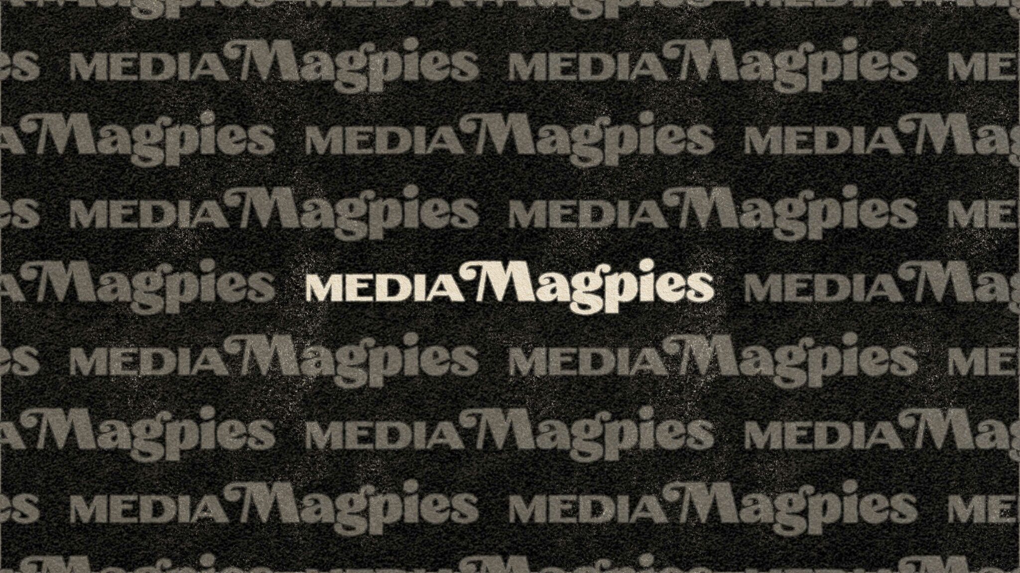
I started with the logotype. The Magpies portion of the logo is a ’70s Windsor-inspired bit of custom lettering—fulfilling the thrift store aspect of the identity—with a heightened contrast of thick and thin strokes, the Cooper Black-esque serifs hacked away, replaced with sharp corners, and some swanky ball terminals added—to give the logo a touch of prestige. I paired this with some hand-lettered high contrast extended type for the MEDIA portion of the logotype.
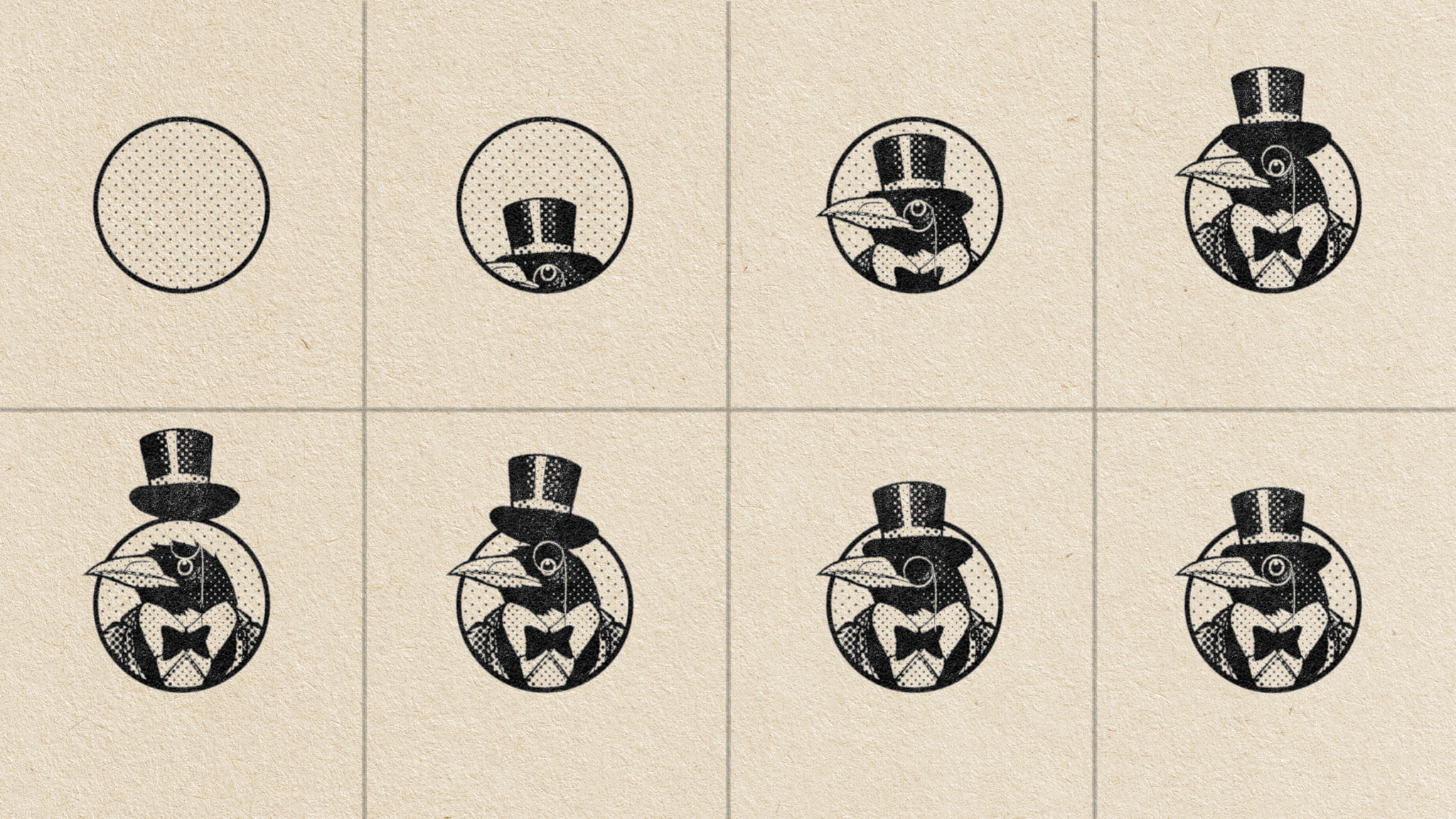
The mascot, Mortimer the Magpie, came to me quickly and almost without thought. I grew up loving my hoity-toity mascots dressed to the nines with their monocles and top hats and air of sophistication. A sarcastic little homage to that just seemed fitting and probably took an hour of my time in total.
Typography
For body type, I chose Atipo Foundry’s fantastic Novela. Novela is incredible as it manages the impossible task of balancing loads of personality with being pleasurably readable for long passages. It never makes your words look like they belong in a textbook; it makes your words look like fine literature. It comes in both a very fine Roman and a downright calligraphic Italic and a massive ten weights, complete with an assortment of number styles (oldstyle, lining), and all sorts of ligatures from the common to the historical. I’m confident Jules Verne and Emily Dickinson both would’ve adored it.
For headlines, I chose Novela’s “‘fat didone’ sister” face, Novela Poster. Novela Poster’s exuberant personality and extremely high contrast boldness would’ve been too much for anything longer than a headline, but it brings tons of swank to the party. This style of typeface came to popularity in early 1800s London, and it’s that vintage quality that helps it to never feel dated or overly trendy, despite having style in excess.
For navigation (and a few other areas), I went with Basier Narrow (again from Atipo Foundry) in ALL CAPS and wide letter spacing. Basier Narrow feels neutral and mid-century modern. And mid-century modern feels timeless to me, despite the name. It’s a typeface that gets out of the way without distracting, looking good alongside all sorts of content.
In a few areas (form labels, headings on non-article pages where a boisterous personality isn’t needed), I used the wider sister font of Basier Narrow, Basier Circle.
Yes, it’s a lot of typefaces. Sue me.
Technology
This website is powered by WordPress, and was designed by me in straight HTML/CSS/Javascript, using Panic Software’s excellent Nova and modified libraries from Codyhouse (specifically their Chameleonic Header experiment, which is what allows the logo and navigation bar to change color as you scroll over different sections, and their Responsive Tabbed Navigation, which we use to combine our writers’ bios, tags, more articles, and comments sections into single tabbed folders, as well as for our Log In and Sign Up interfaces that slides down from the top.) We also use Swiper.js for the rotating carousels of articles on the front page and category pages, and MagicGrid.js for the masonry layout list of the latest articles.
That overly-designed code was then sent to our miracle-worker of a developer, Nick Marcelo of WebDevPH, to get it turned into a functioning WordPress theme.
Plugins we use:
•Advanced Custom Fields for showing our writers’ social media accounts and illustrated portraits in their bios.
•Ajaxify Comments so the page doesn’t refresh every time you want to reply or leave a comment, thereby switching you out of the Comments Tab.
•Comment Edit Core, allowing you to edit your comments for a set period of time after you’ve written it.
•Comments Like Dislike for liking and disliking comments.
•Quick Featured Images for powering the edge-to-edge images at the tops of articles and in the carousels on the main indexes.
•Ultimate Member for powering our user profiles and user account settings.
•Zero Spam for hopefully keeping our site relatively spam-free.
We are hosted in a Portland datacenter operated by Dreamhost.